
If you find that the performance of your mobile site is lagging, look no further than these expert tips to help squeeze more performance out of your website.
Responsive designs are a good idea because they are designs that change dynamically depending on the device. This means they load quickly and easily on a desktop, tablet, or mobile. Google likes this, and it’s good for your SEO. But there are other things you can do…
The following actions should provide effective results in a world where Google prioritizes mobile-first indexing.
Analyse your mobile speed
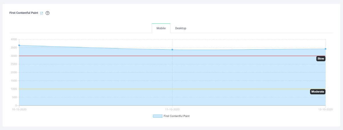
The first step is to see how well or badly your site is doing. Use a speed monitoring tool like Hexometer to see where you stand in relation to your competitors. This first step is crucial because when designing a site, the mobile part is often overlooked. Even though the mobile version is a stripped-down version of the desktop site, more and more people are using mobiles to perform searches, make purchases, and consume internet content.
Reducing page weight
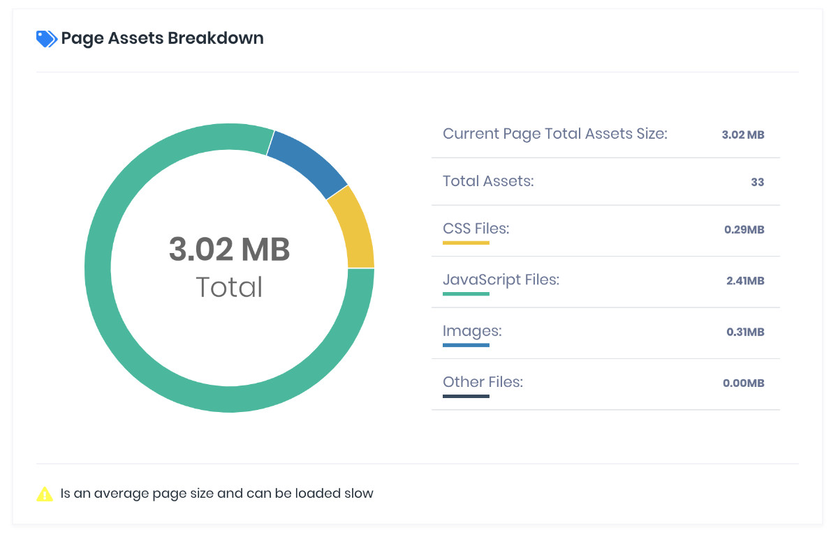
Is your site too heavy for mobile devices? The ideal weight for a website is less than 1,000KB, but almost 80% of websites around the world are larger than 1MB, over half exceed 2MB, and 23% are over 4MB.[1] The heavier the site, the longer it takes to load on a phone, and a customer is more likely to abandon a page if it doesn’t open in a couple of seconds. In fact, even a 1-second delay can hit conversion by up to 20% in the retail sector.[2]
You can reduce page weight by compressing images using a specific tool. For simple images like a logo, use the SVG format because this allows an image to be defined by a mathematical equation rather than millions of pixels.
Be mindful that performance trumps design – there is no point having a beautiful but slow site. Also, remember that each page should be tailored around offering one call to action. A page that offers a million different options will be off-putting to the user; less is definitely more.
Removing automatic page carousels
The customer is probably just going to see the first image of the carousel before they start scrolling, which makes the carousel a little redundant. For better speed, don’t be afraid to make this feature the first thing you jettison.

Don’t use custom fonts
Custom fonts like using code, regardless of whether it’s CSS or JavaScript. You can probably get away with it if it’s just for headers, but normal boxes of text should be filled with standard fonts if you want to maximize page load performance.

Optimizing the search
Make your search box visible above the fold and enable it to autocorrect typos, which are all too common when using a mobile phone. By having a straightforward search channel with properly spelt search terms, the user experience will be frictionless.

Speeding up the checkout process
Allow the customer to pay with a few simple taps. Implement PayPal or Google Play to streamline the process and help returning customers by remembering the information they gave with their previous purchases. It’s a simple way of boosting conversions on your site, which is great for your business.
This rule of thumb works generally, too. Reducing the steps on any part of your website so that a user only gets the most relevant information is advisable.

Reduce server response time
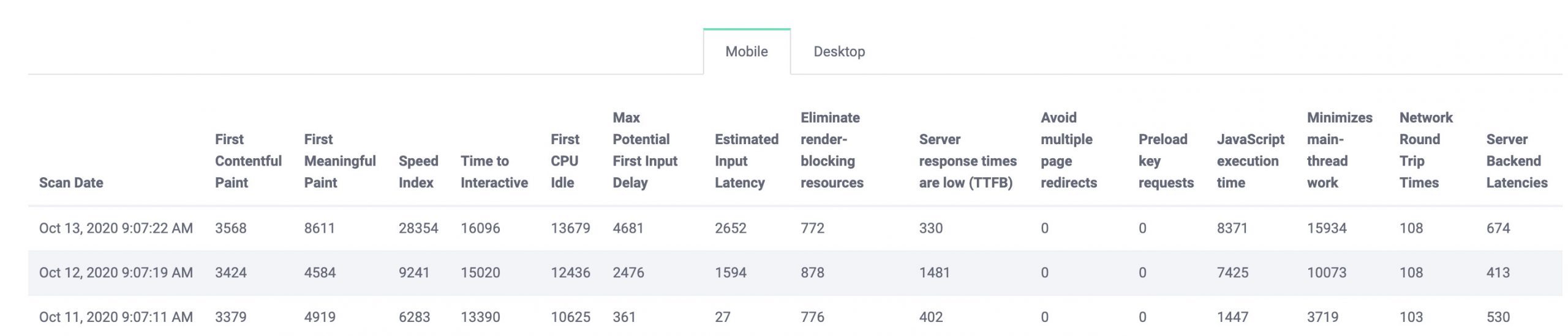
For better and faster user experiences, Google recommends that the time to first byte (TTFB) should be under 200ms.
Load visible content first
According to Google’s RAIL Performance Model, meaningful paint should be delivered in 1 second and time to interactive should be delivered in 5 seconds or less. On up-to-date phones and on faster Wi-Fi, faster deliveries can be made. Overall, a good first impression will be made on the user if these deliveries can be swiftly performed.
Avoid redirects
Redirects trigger additional HTTP request-response cycles, which delay page rendering because every image, CSS file, and script has to go through the redirect. Monitor what redirects are on your website and change any redirects which are not strictly necessary.
Of course, redirects can boost SEO and user experiences, so be judicious with what you modify.
Minify
The number of HTTP requests made on your site depends on all the HTML, CSS, and JavaScript files that are on the website. By combining all three files, loading a page can be faster because the number of files that have to be loaded and the total file size of your site is reduced.
You can also minify, which reduces any unnecessary characters in the aforementioned files. By getting rid of white spaces, block delimiters, comments, formatting, or other things that are not needed for the code to execute, loading a mobile web page is more streamlined.
Leverage browser caching
Enable browser caching so that the user can avoid downloading a website’s static content, provided that they are using a browser that can cache static files. This makes the user experiences a lot faster.
The proof is in the pudding
According to Google, one company was able to reduce page load times by 28% and the bounce rate by 4% after following these steps. Ultimately, this resulted in mobile sessions growing by 19% and entries in the company’s online booking engine increased by 13%.
So, these tips work. The solutions are there, so create an action plan for implementation. Don’t forget to monitor regularly so you can ensure your mobile’s performance stays at a high level. You can use hexometer.com for continuous page speed monitoring based on crucial performance metrics, which can help you to detect anomalies and see growth opportunities. By using this tool, you will improve your SEO and create a better user experience.
CMO & Co-founder
Helping entrepreneurs automate and scale via growth hacking strategies.
Follow me on Twitter for life behind the scenes and my best learnings in the world of SaaS.